
Custom Banner Color Psychology shapes how viewers perceive your message and can influence engagement from the first glance. When you choose hues with intent, you signal action, trust, or urgency through thoughtful design. This approach blends color psychology in marketing with color theory for banners to craft palettes that support your goals. By aligning hue choices with objectives like awareness or conversion, you can boost performance across banners. In this introductory guide, you’ll learn practical steps to apply these concepts to banners so your color choices consistently perform.
Think of color strategy as a visual language where hues act as signals for value, trust, and urgency before a reader even scrolls. From a branding perspective, color semantics, hue signaling, and contextual testing help explain why certain palettes feel more persuasive. Prioritizing color choices often means balancing contrast, readability, and accessibility while guiding attention to a clear CTA. By applying these ideas across channels, such as web, mobile, and email, you create a cohesive color narrative that supports your campaign goals.
1) The Science Behind Banner Color Psychology and Viewer Response
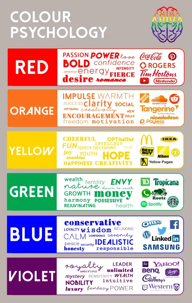
Color signals in our brains happen almost instantly, shaping perceptions and actions before we consciously decide what to do. This is where banner color psychology comes into play: the hues you choose act as subconscious nudges that influence attention, emotion, and intent. By understanding how color communicates value, urgency, or trust, you can design banners that align with your campaign goals and resonate with your audience from the first glance.
Warm tones like red and orange can spark energy and a sense of immediacy, which is useful for time-sensitive offers or limited deals. Cool tones such as blue and green tend to evoke reliability and calm, supporting messages about durability, safety, or long-term value. When you tailor banner colors to your objective—awareness, consideration, or conversion—you leverage color psychology in marketing to guide viewers toward a desired action.
2) Aligning Banner Colors with Marketing Goals: From Awareness to Conversion
A successful banner anticipates the user’s journey, and color choices should reflect where the audience is in that journey. For awareness, you might use refreshing, high-contrast combinations that grab attention without overwhelming the message. For consideration, slightly more restrained palettes with clear hierarchy help users compare options. For conversion, bold CTAs and action-oriented hues can nudge clicks and sign-ups.
The broader field of color theory for banners emphasizes legibility, contrast, and emotional signaling. By aligning your palette with your marketing objective, you create a coherent signal that enhances the perceived value of your offer. Remember to balance brand cues with color cues that signal action and trust, so your banner remains both persuasive and credible.
3) Custom Banner Color Psychology: Crafting Audience-Resonant Hues for Performance
Custom Banner Color Psychology provides a practical framework for selecting hues that align with audience preferences and brand identity. This approach blends science with strategy, ensuring that color choices reinforce your value proposition while maintaining recognizability across campaigns.
To implement this framework, start by defining the objective, researching audience colors that resonate, and building 2–3 palette options that emphasize a primary hue plus one or two accents. Test for readability and accessibility, then run A/B tests to compare performance. Over time, you’ll refine your color strategy toward conversion-boosting colors that consistently perform within your brand system.
4) Color Theory for Banners: Harmony, Contrast, and Readability
Color theory provides practical methods for creating banners that are visually appealing and instantly readable. Using a color wheel, you can craft harmonious palettes through complementary, analogous, or triadic schemes. Each scheme offers a different mood and level of contrast, helping you balance aesthetics with the need for clear messaging.
Regardless of the scheme, ensure strong contrast between background and text and a prominent CTA that stands out from surrounding elements. This intersection of color theory for banners and banner color psychology supports accessibility, aiding legibility for diverse audiences and devices while maintaining brand signals.
5) Palette Strategies for Different Goals and Audiences
Different contexts call for different hues. E-commerce banners often rely on high-contrast combinations with a bold CTA to drive quick actions, leveraging effective banner colors that spark impulse purchases. SaaS banners tend to use trust-inducing blues with a clean secondary color to encourage sign-ups and trials.
In health and wellness, greens and earth tones convey safety and balance, with vibrant accents to highlight offers. Fashion and luxury can benefit from navy, charcoal, or black paired with metallic or ivory accents to communicate sophistication. Always consider audience demographics and cultural context, and couple palette choices with quick tests to tailor hues to real users.
6) Measuring Impact: Testing, Accessibility, and Analytics for Banner Color Strategy
Beyond clicks, track micro-conversions and engagement signals such as hover time and CTA activation to gauge color effectiveness. A/B testing different palettes helps identify statistically meaningful improvements and builds a repository of data you can reuse across campaigns. These insights align with the broader aim of conversion-boosting colors that reliably raise engagement.
Accessibility checks are essential to ensure your color strategy serves all users. Maintain sufficient contrast, avoid color-only signals, and test readability across devices and lighting conditions. By combining analytics with accessibility-focused design, you can validate your banner color psychology approach and continuously optimize for both performance and inclusivity.
Frequently Asked Questions
How does Custom Banner Color Psychology leverage conversion-boosting colors within banner color psychology to drive conversions?
Custom Banner Color Psychology guides hue choices to align with audience signals and brand. By selecting conversion-boosting colors that prompt action and ensuring high-contrast text, banners can improve click-through rates and conversions. Pair color choices with accessibility checks and A/B testing to optimize performance.
What does color theory for banners reveal about selecting effective banner colors in the Custom Banner Color Psychology framework?
Color theory for banners helps create harmonious palettes (complementary, analogous, triadic) while keeping readability. In the Custom Banner Color Psychology framework, choose a primary hue with accents that draw attention and stay consistent with your brand, ensuring strong contrast for legibility and effectiveness.
Which banner color psychology strategies yield the most effective banner colors for CTAs according to color psychology in marketing?
Effective CTA colors rely on high contrast and context-appropriate signals. For example, action-oriented hues like red or orange can drive clicks, while blue conveys trust when paired with a clear CTA. In banner color psychology, test CTA colors against backgrounds to find what resonates with your audience and use results to refine campaigns.
How can color psychology in marketing inform banner decisions within the banner color psychology framework?
Color psychology in marketing informs choices about urgency, trust, and value conveyed by hue. The banner color psychology framework combines these signals with brand constraints to select palettes that support goals such as awareness, consideration, or conversion.
What steps should you take to test and optimize banners using Custom Banner Color Psychology and conversion-boosting colors?
Define the objective, understand the audience, and build 2–3 palettes emphasizing a primary hue plus accents. Check readability and accessibility, run A/B tests focusing on CTR and conversions, and iterate using winner data to refine color choices.
How do accessibility and readability affect banner color psychology and the choice of effective banner colors within Custom Banner Color Psychology?
Accessibility requires sufficient contrast to keep text legible and maintain inclusivity. In Custom Banner Color Psychology, balance mood and brand signals with high-contrast combinations, ensuring readability while preserving the intended psychological cues.
| Topic | Key Idea | Relation to Custom Banner Color Psychology |
|---|---|---|
| Introduction | Color influences perception, behavior, and the bottom line; hue signals messages; Custom Banner Color Psychology helps choose hues that resonate with audience and align with brand to boost engagement, CTR, and conversions. | Sets the stage for how color affects outcomes and the purpose of applying color psychology. |
| The science behind color | Color acts as a subconscious signaling system; warm colors convey urgency and excitement while cool colors convey trust and calm. | Links color choices to marketing objectives and viewer responses. |
| Banner color psychology in practice | The banner’s primary goal is to capture attention and persuade action; the palette should support the objective; Custom Banner Color Psychology provides a framework to communicate value and influence on-page behavior. | Translates theory into actionable design practice. |
| Color choices by goal and audience | Align palettes with goals and audience; high-contrast CTAs for action; premium products use sophisticated tones; tailor hues via research or A/B testing. | Guides strategy by context and audience. |
| Color theory for banners | Use harmony, contrast, and readability; common schemes include complementary, analogous, and triadic; ensure text-background contrast and accessible CTAs. | Provides a framework for building effective, accessible palettes. |
| Contrast and readability in conversion | Crisp typography and legible messaging; high contrast; CTAs should stand out with contrasting color; testing hue/brightness effects CTR. | Emphasizes readability and testing as drivers of conversion. |
| Brand consistency vs. experimentation | Maintain recognizability; extend brand palette for campaigns with brighter accents to drive action. | Balances consistency with optimization for performance. |
| Accessibility and inclusivity in design | Ensure text contrasts sufficiently; account for color vision deficiencies; test across devices to maximize readability and inclusivity. | Integrates accessibility into color decisions. |
| Measuring success and what to track | Track micro-conversions, CTA interactions, and on-site behavior; use analytics to compare color variations and build a data-driven library. | Defines metrics and supports data-driven optimization. |
| Practical steps to pick hues that sell | Define objective; understand audience; review brand constraints; build 2–3 palettes; test readability and accessibility; run A/B tests; iterate. | Offers a concrete process for applying Custom Banner Color Psychology. |
| Color palettes by context | Illustrates context-specific palettes: e-commerce high-contrast CTAs; SaaS blues; health greens; fashion with navy and accents. | Demonstrates how Custom Banner Color Psychology applies across contexts. |
| Common mistakes to avoid | Overloading with too many colors; ignoring brand alignment; skipping accessibility checks; failing to test. | Warns against common pitfalls when applying color psychology. |
Summary
Custom Banner Color Psychology is a framework for selecting hues that resonate with your audience and reinforce your brand while nudging viewers toward action. By combining color theory, readability, and brand alignment, you design banners that convey value, build trust, and improve engagement and conversions. When you tailor colors to specific goals—awareness, consideration, or conversion—and validate choices with testing, you increase CTR and ROI. This approach also emphasizes accessibility, ensuring legibility across devices and contexts. In practice, a scalable color system and disciplined experimentation help sustain brand coherence while driving campaign performance.